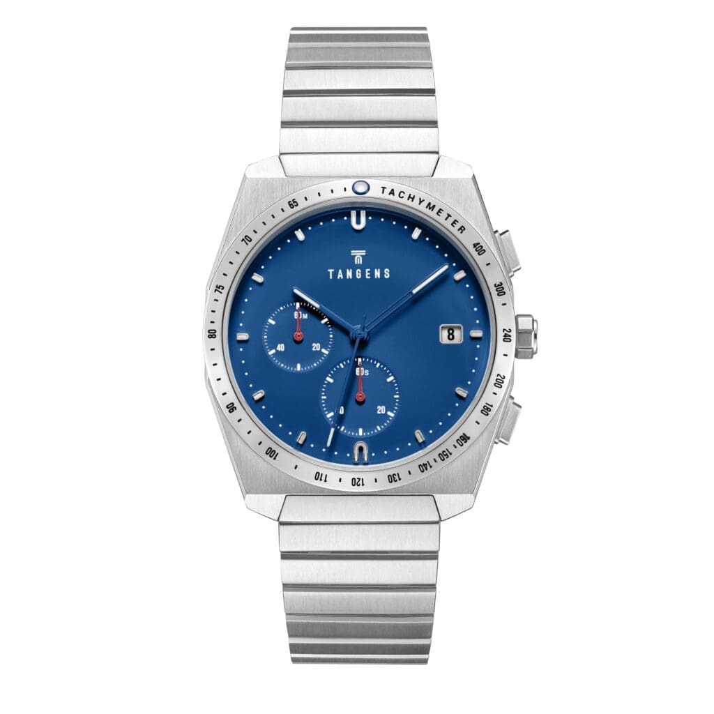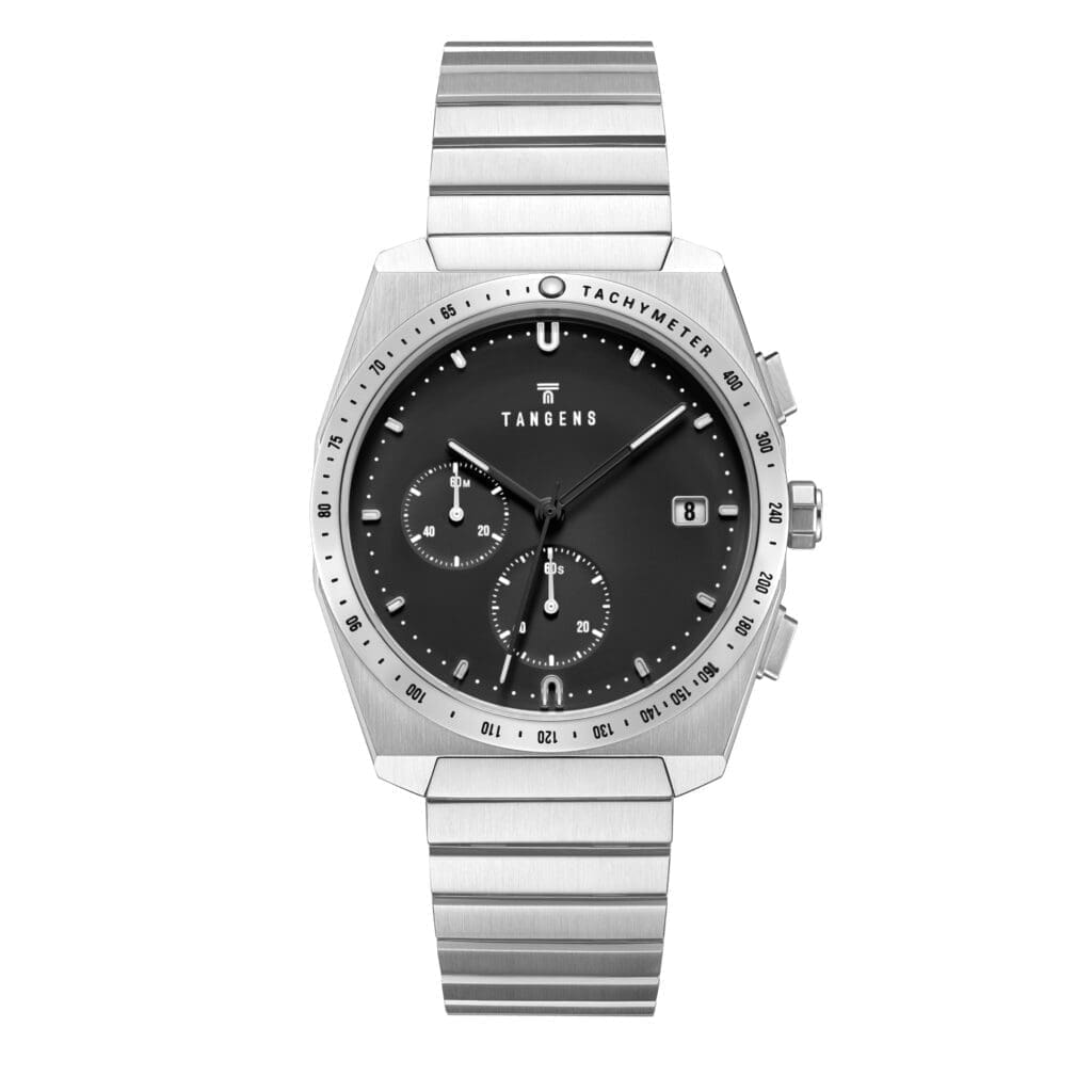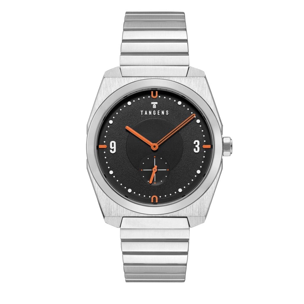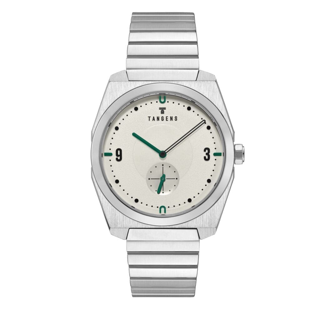
Ink
Black
Stone
Canvas
Sand
Card
tg-h-hero
Usage: Headlines sitting directly on top of full-bleed photography or video (homepage hero "KOMPOSITION AUTOMATIC", the movement/craft video banner "MIYOTA 9039 AUTOMATIC"). Always left-aligned, bottom-anchored to the image. Always pair with a legibility scrim/gradient behind the text — never assume the underlying image is dark enough on its own.
tg-h-section
Usage: Main headline for a full-width, symmetric editorial section not sitting on imagery ("STOP / TOUCH / MOVE", "BUILT TO CREATE PEACE OF MIND"). Centered by default; use left-aligned when the header introduces a content block (e.g. PDP description panel) rather than standing alone.
tg-h-feature
Usage: Headline paired with a single adjacent image in an asymmetric two-column block (product highlight rows like "Komposition Automatic / Chronograph / Komposition", PDP "Description"). Left-aligned.
tg-h-card
Usage: Smaller headline for individual cards within a 3-column icon or feature grid ("Free worldwide delivery", "STOP", "TOUCH", "MOVE"). Centered, paired with a centered icon above it.
tg-h-stat
Usage: The bold short value in a Stat/Spec Pair (PDP "HIGHLIGHTS" row: "38 mm", "10 ATM", "Slim case"). Centered, always paired with a tg-meta label beneath it.
tg-eyebrow
Usage: Small tracked uppercase label preceding a headline ("OUR PHILOSOPHY", "AS FEATURED IN", "TIMESTAMPS", "OUR WATCHES"). Also reused as the micro-label in Technical Spec Cells ("CASE", "BRACELET", "MOVEMENT"). Always inherits the alignment of the headline it precedes.
tg-body
Usage: All paragraph copy — descriptions, philosophy text, footer newsletter blurb.
tg-body-sm
Usage: All paragraph copy — descriptions, philosophy text, footer newsletter blurb.
tg-meta
Usage: Grey, sentence-case secondary details — product variant names ("Matte steel"), delivery timing, VAT notes, Stat labels beneath tg-h-stat ("Case diameter", "Water resistance"). Distinct from tg-eyebrow: sentence case, no tracking, purely informational rather than a section kicker.
tg-btn-label
Usage: Text inside primary buttons ("Add to cart", "Checkout").
tg-link
Usage: Underlined inline links, with or without a trailing arrow ("Explore →", "View collection"). Same size scale as tg-body.